AlphaDrivers237
A chauffeur network has to feel safe before anyone gets in the car. That's a brand problem.
Mich’s note my first design internship. It's a lot of work
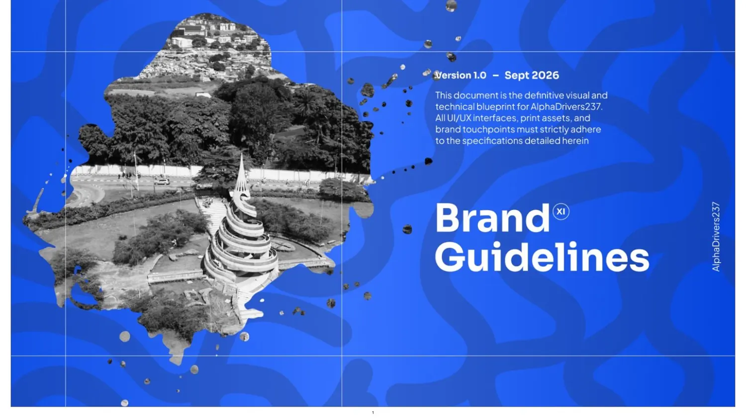
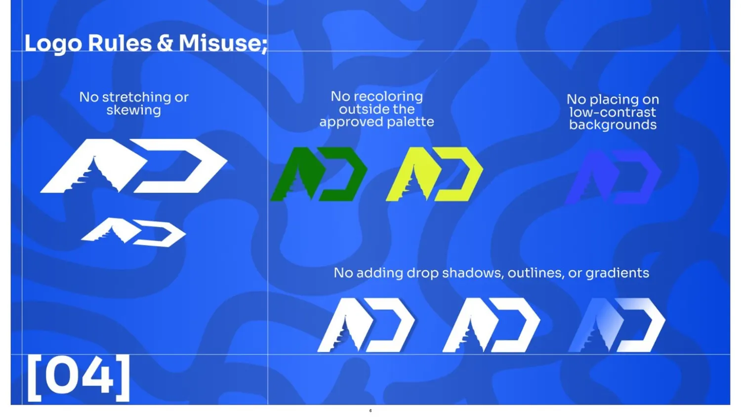
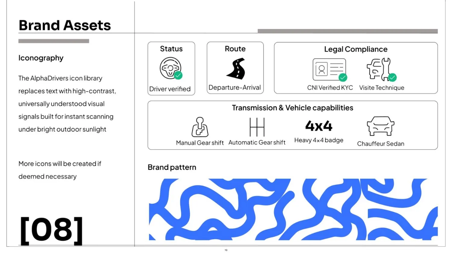
AlphaDrivers connects vehicle owners with certified professional drivers in Douala, Yaoundé, Bafoussam and Buea. I designed the identity and wrote the brand guideline: logo system, colour, type, iconography and the rules that hold it all together.
Where it started
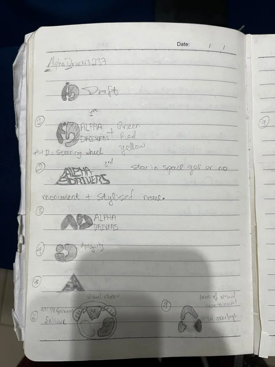
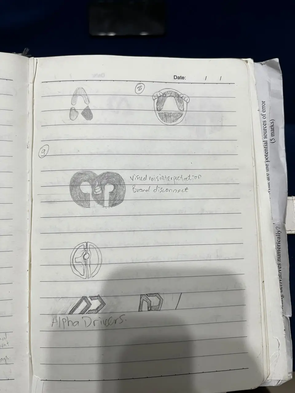
The idea in my notebook: A + D, shaped like a steering wheel. Several drafts died for reasons I wrote right next to them: visual clutter, misinterpretation, brand disconnect.
01
The thought
Seven drafts, seven verdicts.
Numbered drafts on one page, each with an honest note next to it. Draft six: “all overlaying, failure.” Notes like that are how the good one survived.
02
The brand
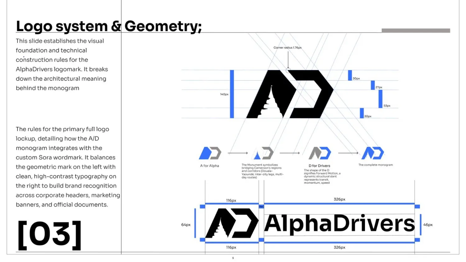
Geometry, status colours, three typefaces.
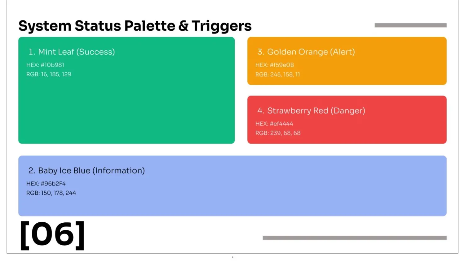
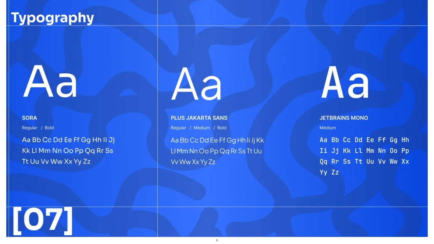
A monogram built on a grid, a palette that doubles as a status system (success, alert, danger, information), and Sora, Plus Jakarta Sans and JetBrains Mono, each with one job.
- Crayola Blue#3772FF
- Midnight Violet#241F38
- Deep Navy#0D225C
- Ghost White#F7F6FC
- Ink Black#171C26
03
The experience
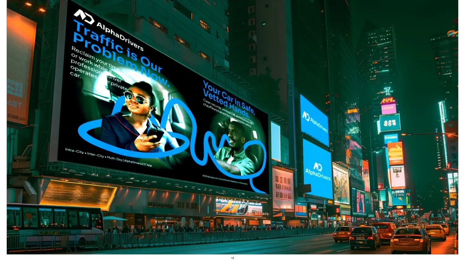
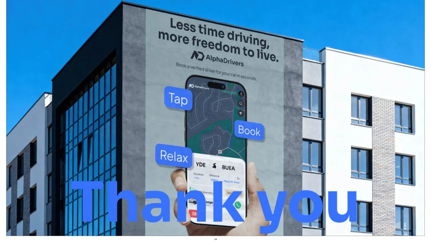
Less time driving, more freedom to live.
Where it landed
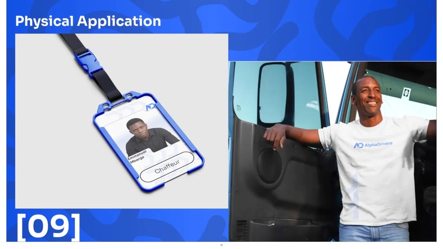
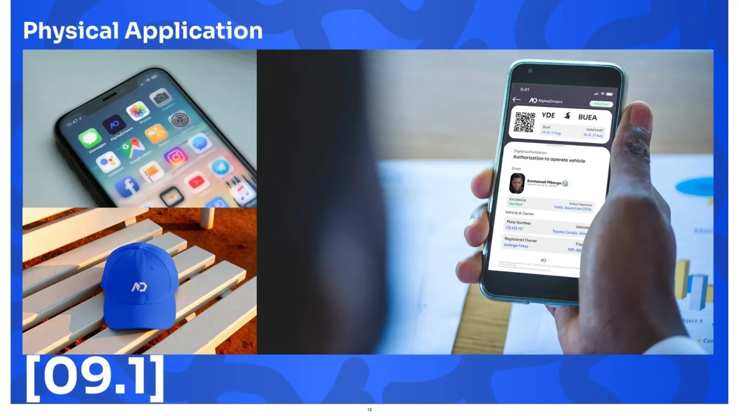
Version 1.0 of the guideline: a geometric A/D monogram, a blue system whose status colours actually mean something on screen, three typefaces with clear jobs, and applications from lanyards to billboards. Also my first real lesson in how much work a “simple” logo is.