ByKenzel
From “simple but plain” to an auteur's signature: a rebrand for a photographer and filmmaker.
Mich’s note first brand to trust me

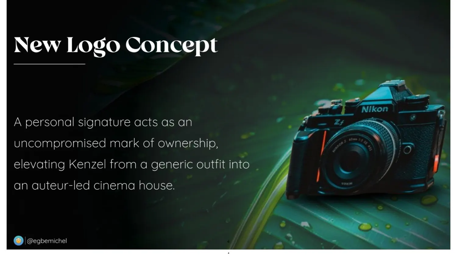
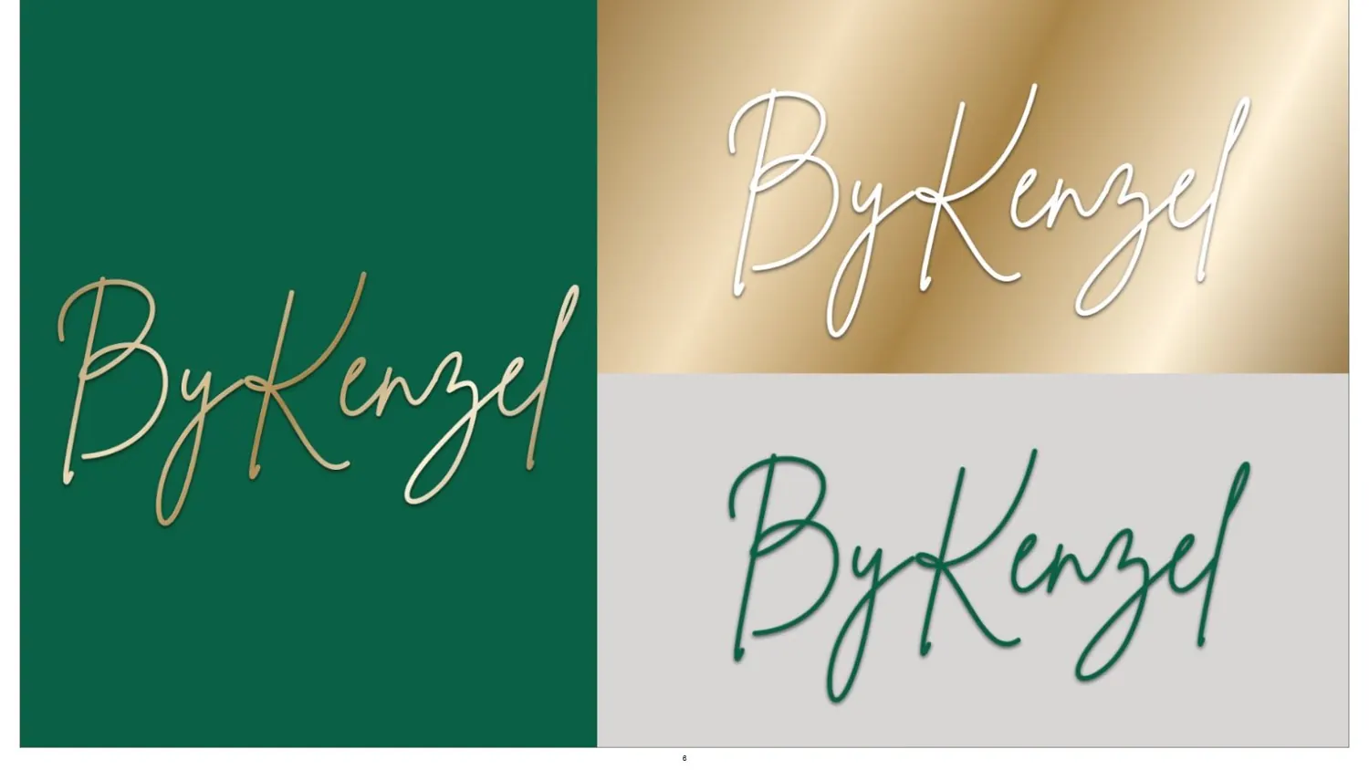
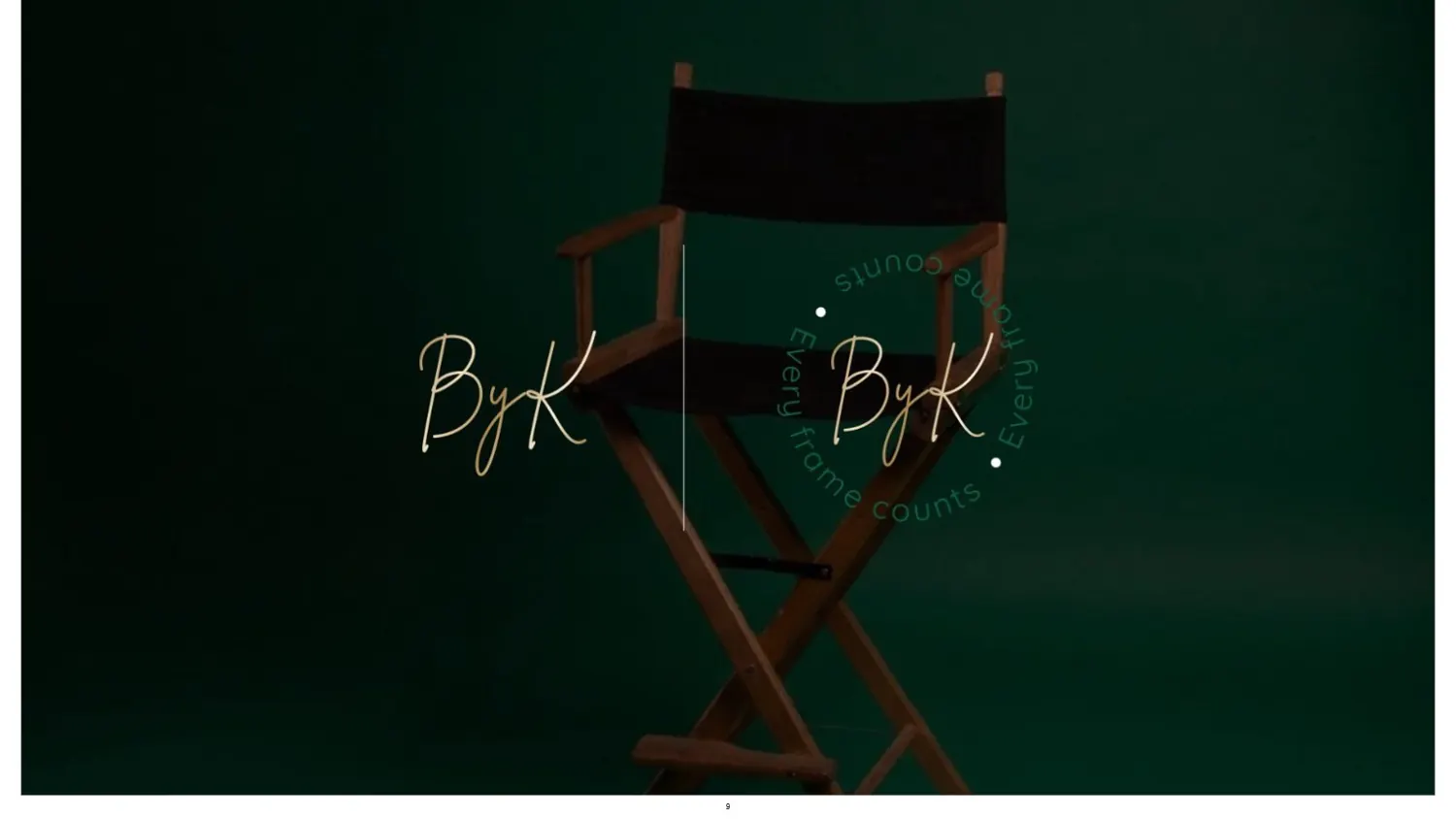
Kenzel shoots photos and films. His old logo didn't say any of that. The rebrand turned his name into a signature: a mark of ownership, the way a director signs a film.
Where it started
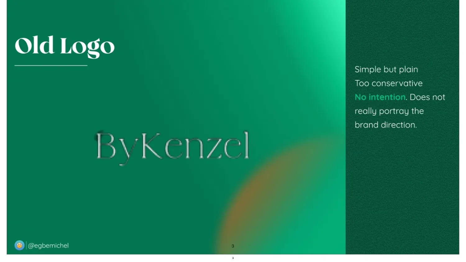
His old wordmark, in my notes at the time: simple but plain, too conservative, no intention. It didn't portray where the brand was going.
01
The thought
What does it look like to listen first?
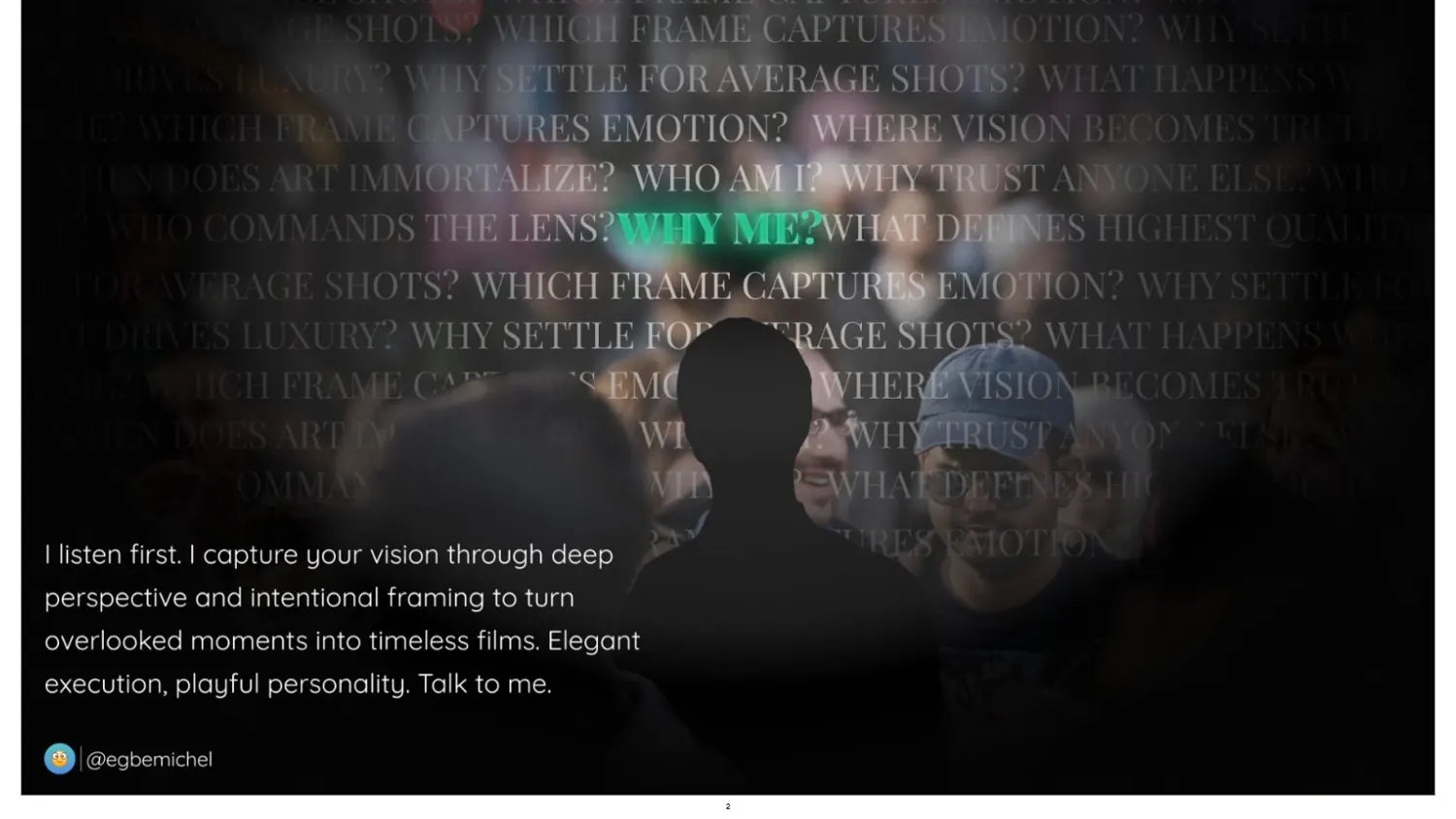
Kenzel's own line set the tone: “I listen first. I capture your vision through deep perspective and intentional framing.” The old logo said none of that. The new one had to.
02
The brand
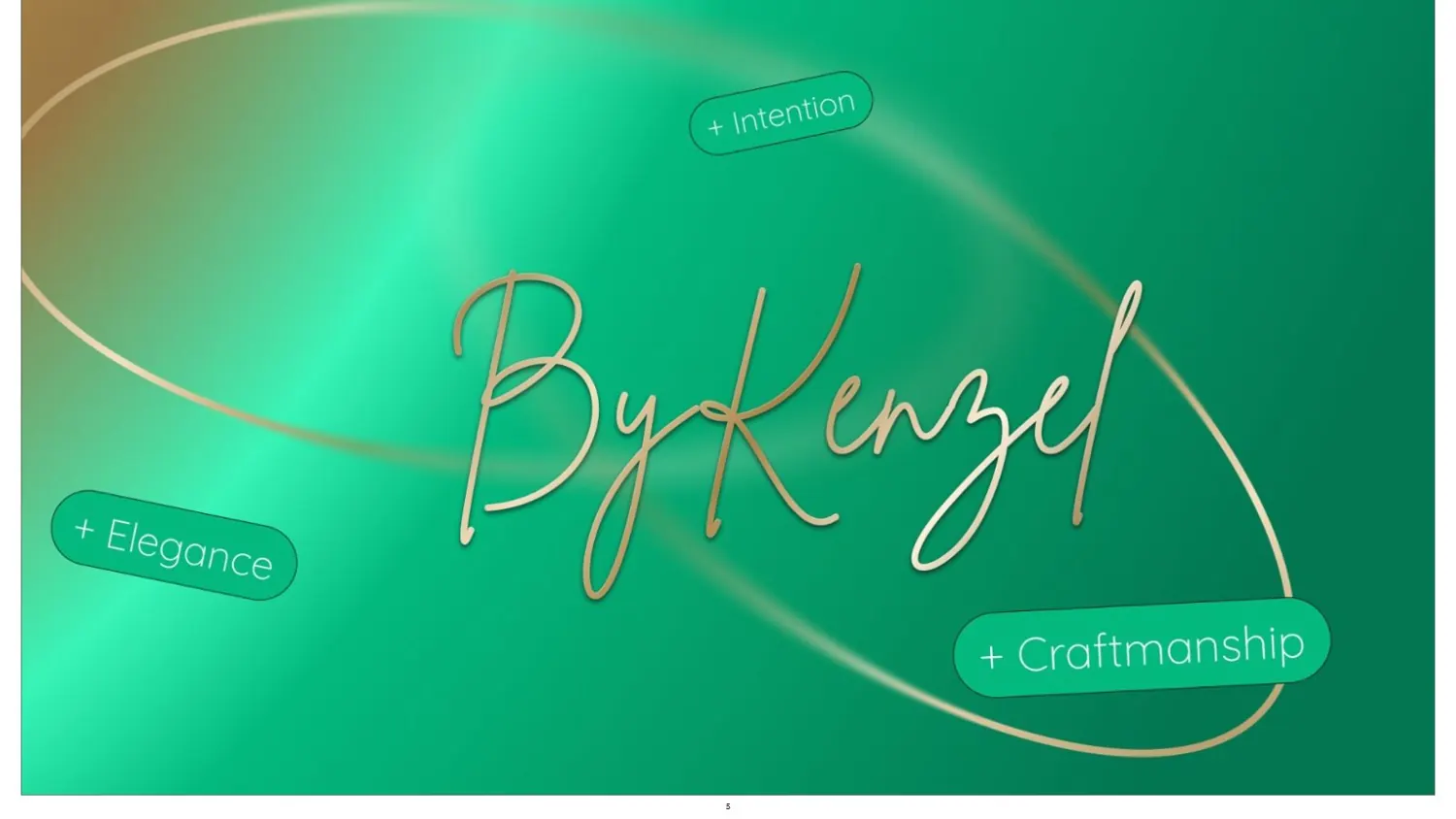
A signature, not a font.
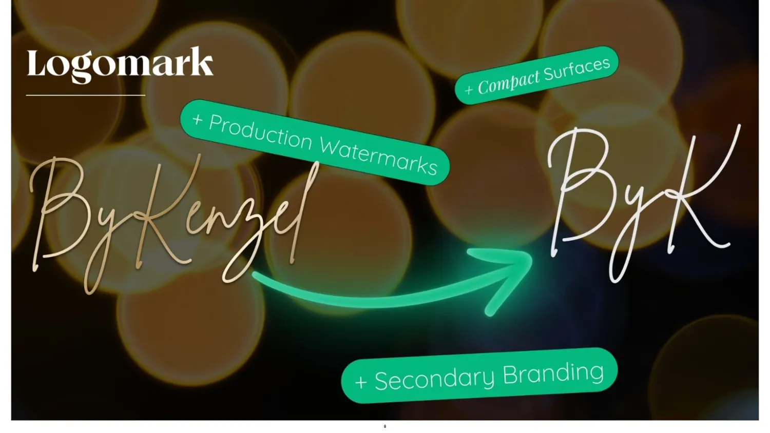
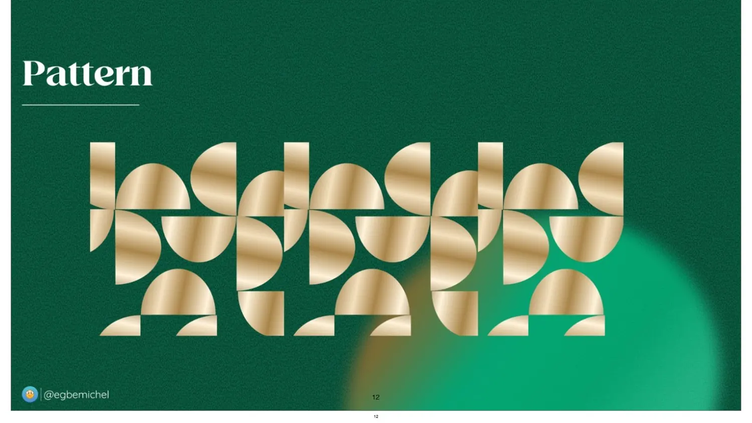
Elegance, intention and craftsmanship in one stroke, with a compact BK for watermarks and small spaces, and a pattern cut from the same curves.
- Emerald green#0A6044
- Gold#C9A45C
- Black#000000
- White#FFFFFF
03
The experience
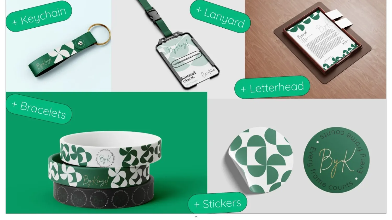
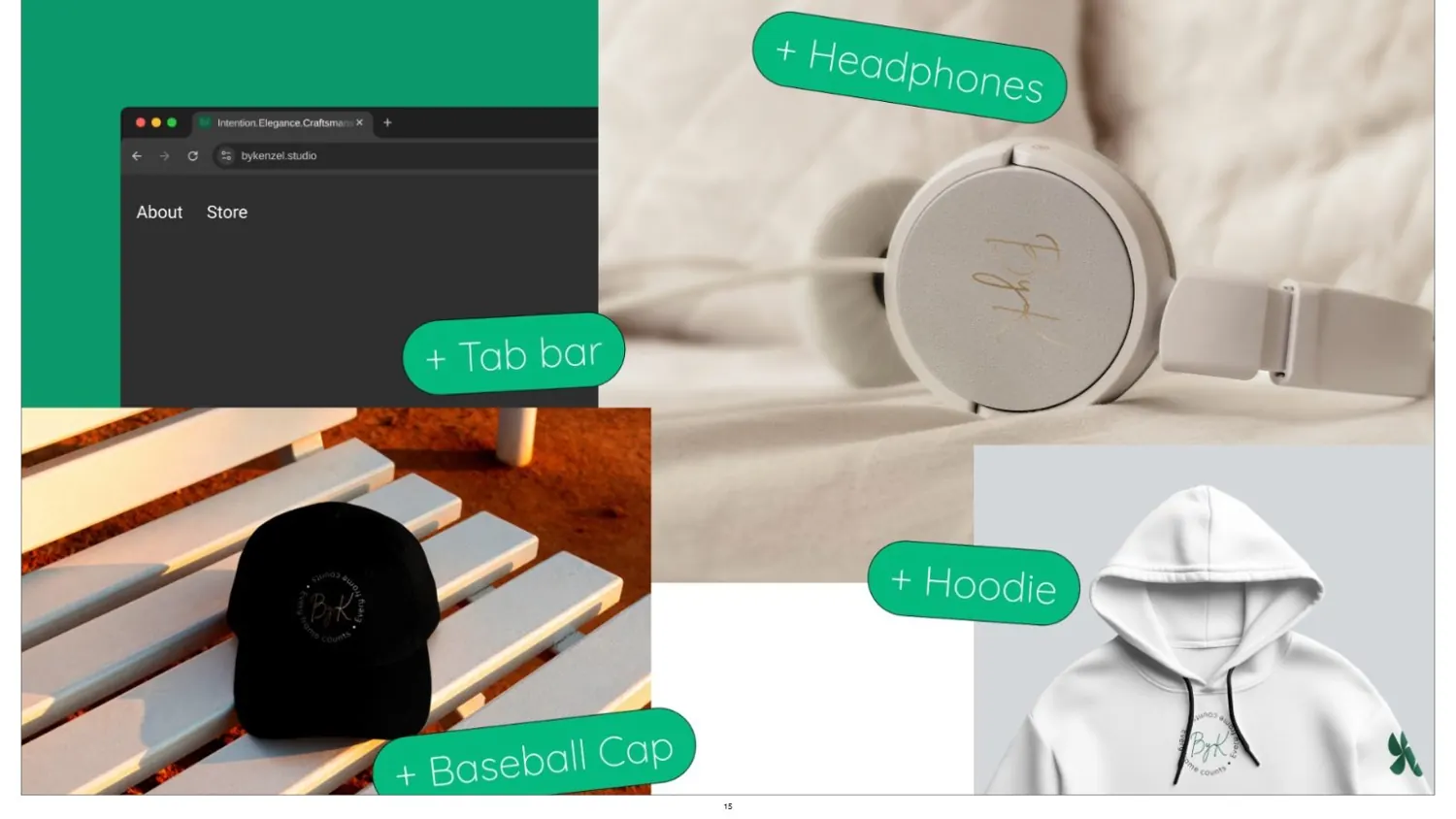
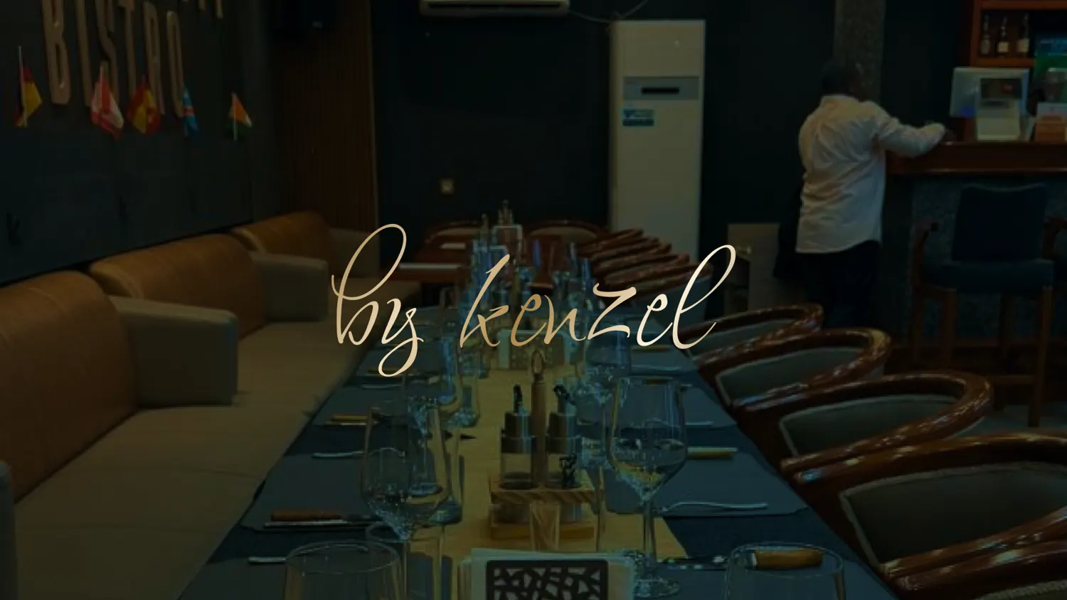
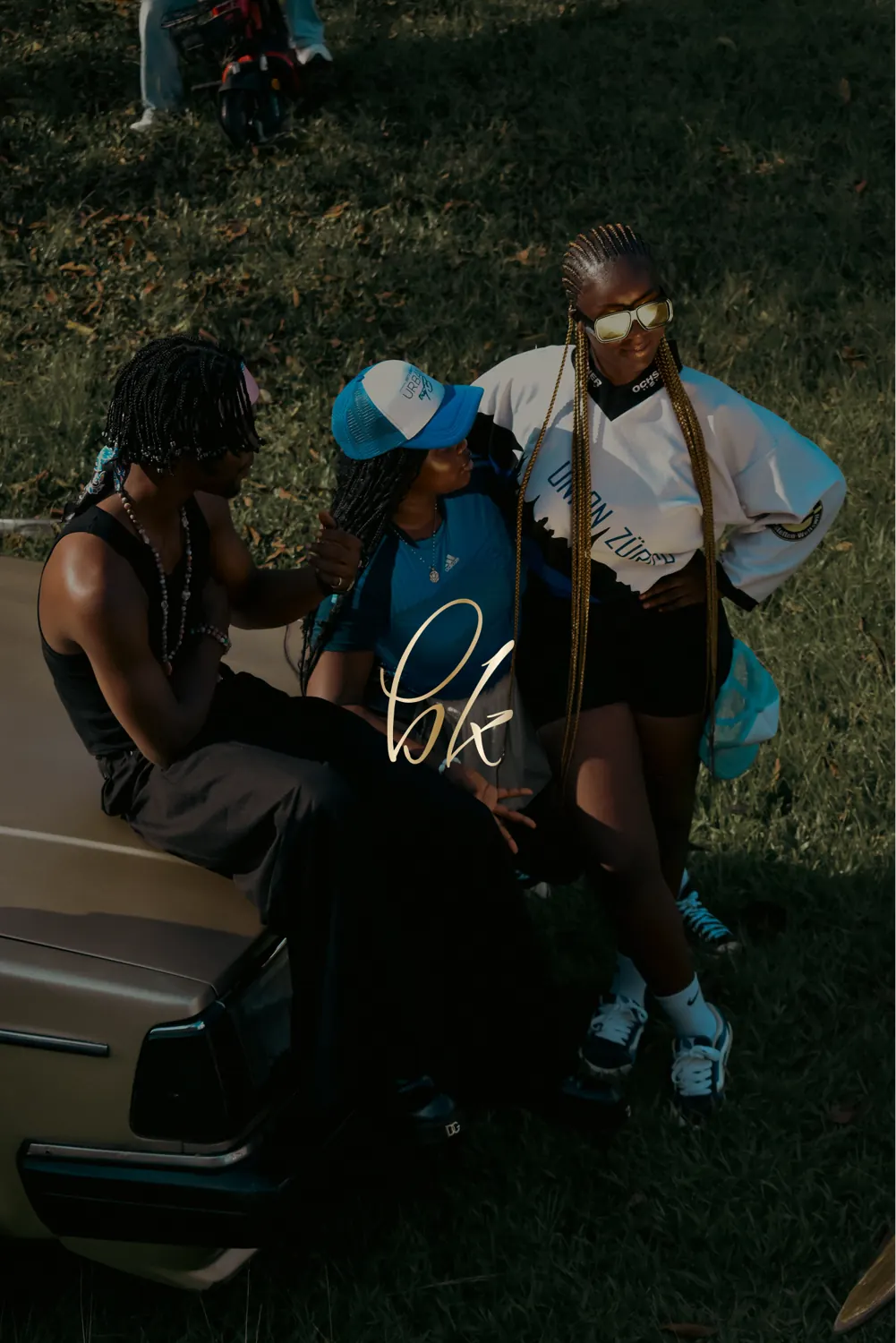
On merch, on screen, and signed into his own work.
Where it landed
A hand-signed logotype with a compact BK mark, emerald and liquid gold, a geometric pattern, and rules for keeping the script intact. He was the first client to trust me with his name. I didn't take that lightly.