Mich, the brand
An identity for a person, not a profession. You're standing in it.
Mich’s note finally took the time to brand myself
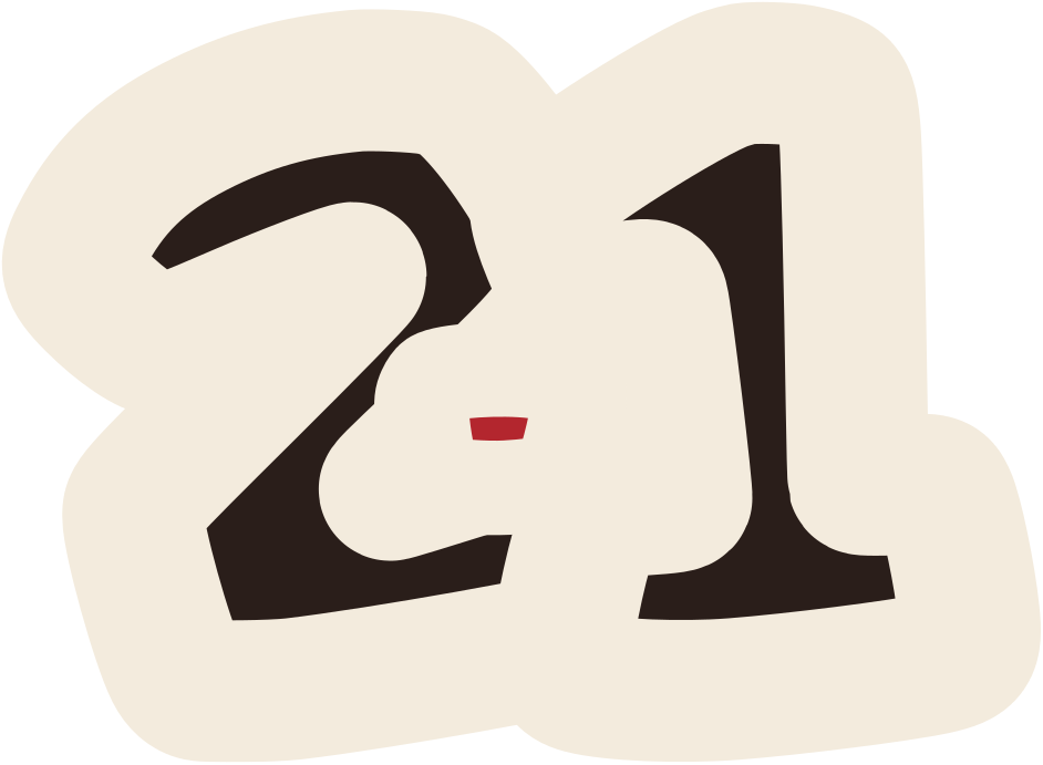
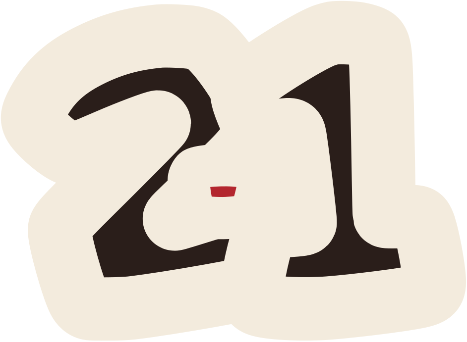
My own identity: a wordmark, a monogram, a number and a red dot that refuses to sit still.
Where it started
My old site introduced a job title. I wanted something that still made sense if the job title changed.
01
The thought
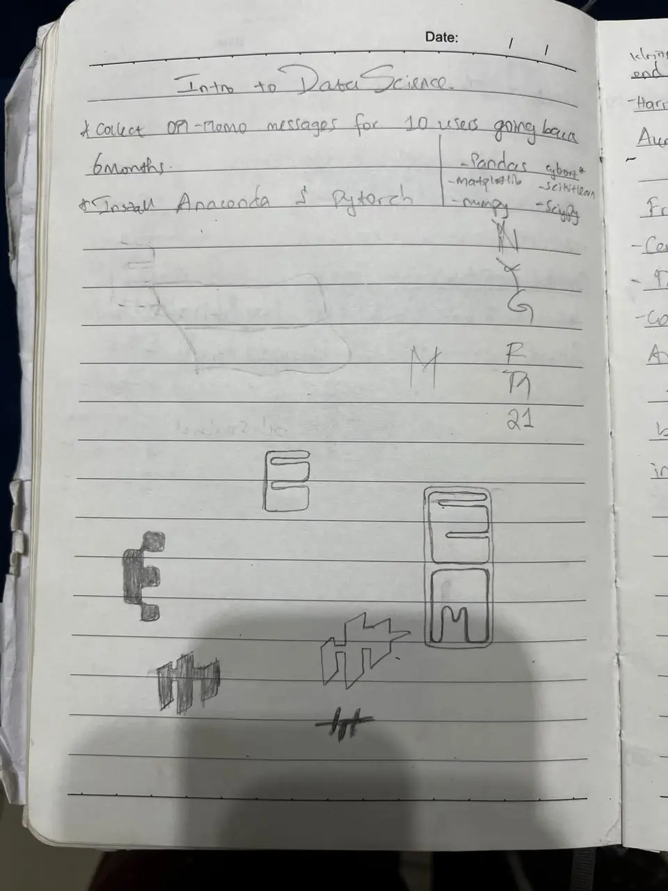
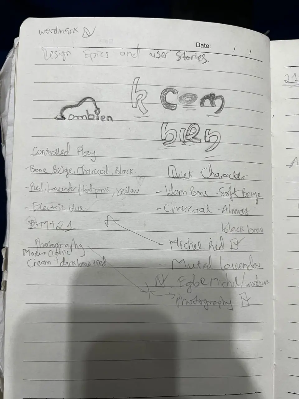
Doodles in the margins of a data science page.
The first E, M and 21, drawn where they shouldn’t have been. Later, the page where it all came together: cream, dark brown, Michel red.
02
The brand
Three marks and a dot.
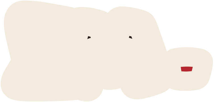
Every red dot on this site is the same one, from the same logos.
- Cream#F3EBDD
- Dark brown#2A1E1A
- Red#B3262E

03
The experience
You're standing in it.
Scroll to the bottom. The dot always finds its way home.
Where it landed
Cream and dark brown doing the work, red used like punctuation, hand-drawn marks with a sticker outline. This site is its first real test. The other worlds are its proof that it knows when to step aside.