Wendy's Treats
A bakery brand with a 1950s mascot, pillowy type and one job: feed your inner child.
Mich’s note she was sooo sweet
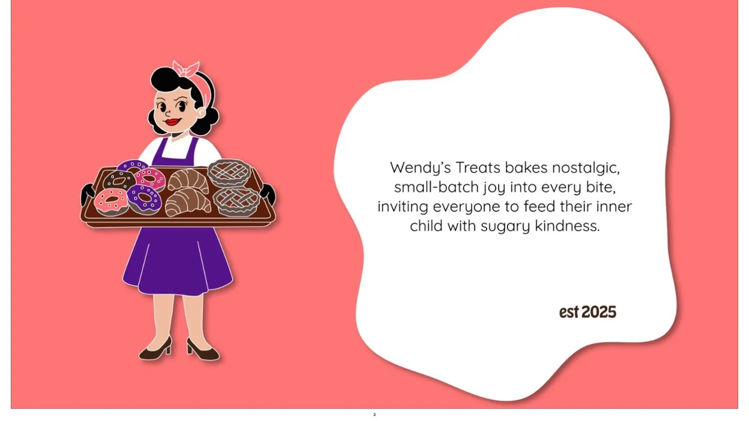
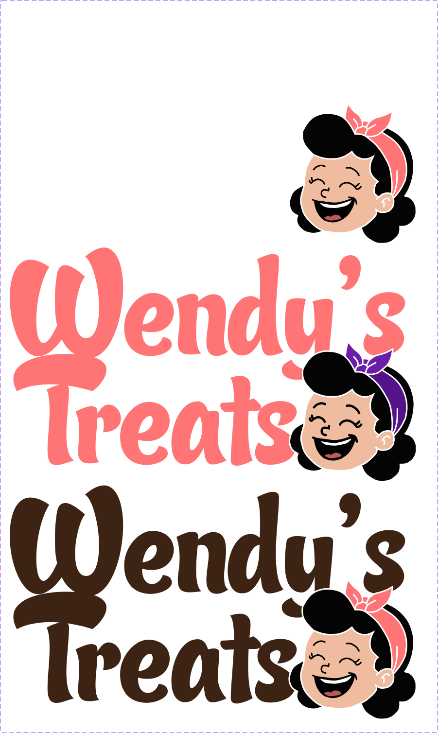
Wendy bakes nostalgic, small-batch treats. The brand had to feel like her: warm, a little retro, and impossible to walk past without smiling.
Where it started
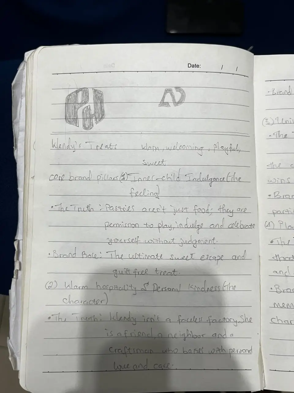
A baker with a lot of love and no visual identity. The line I kept coming back to: Wendy isn't a faceless factory. She's a friend, a neighbour, and a craftsman who bakes with personal love and care.
01
The thought
Notes first, sketches second, colour last.
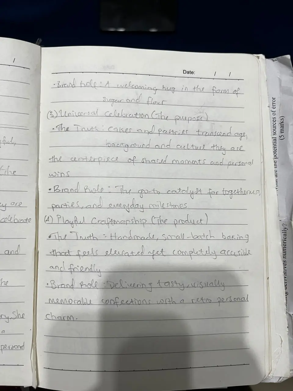
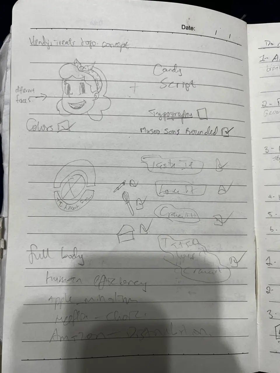
Pages of notes before a single colour: the brand pillars, the truth behind each one, and an early sketch of the face that became the mascot.
02
The brand
Four pillars, straight from the notebook.
- 01
Inner-child indulgence
Pastries aren't just food. They're permission to play, indulge and celebrate without judgment.
- 02
Warm hospitality
Wendy isn't a faceless factory. She's a friend, a neighbour and a craftsman.
- 03
Universal celebration
Cakes and pastries cross every age and background. They're the centrepiece of shared moments.
- 04
Playful craftsmanship
Handmade, small-batch baking that feels elevated yet completely accessible, with retro charm.

03
The experience
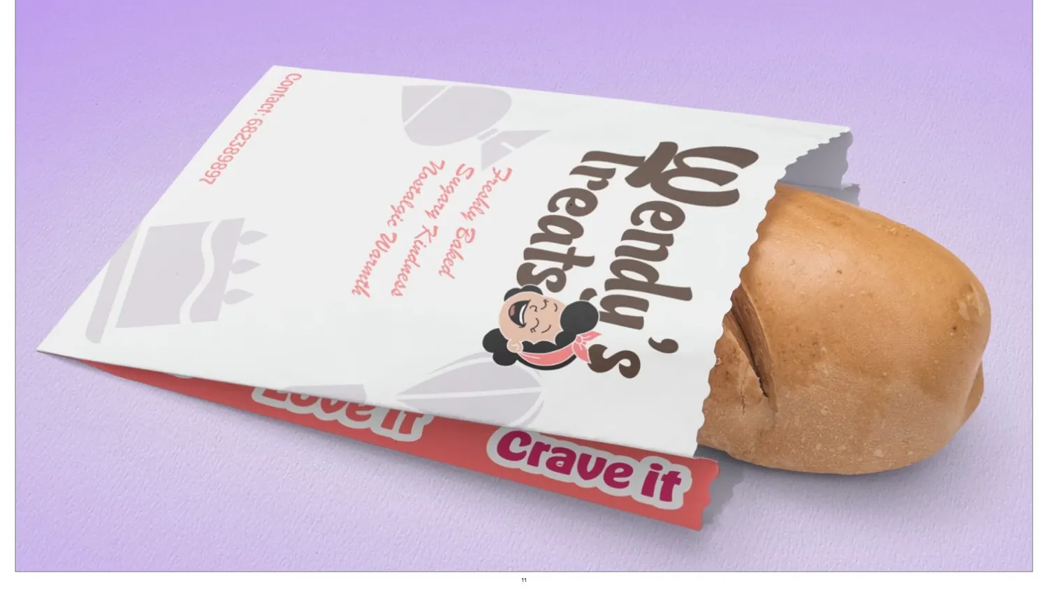
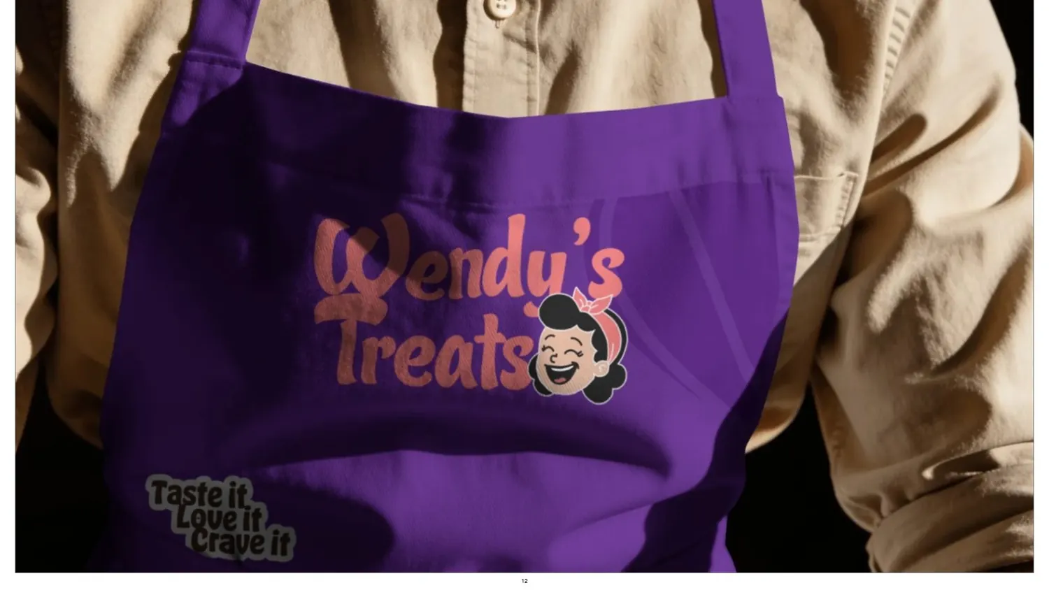
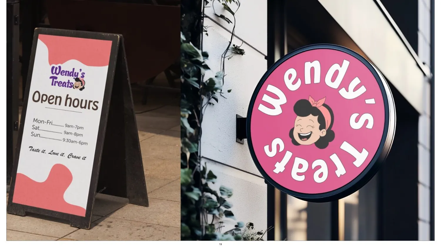
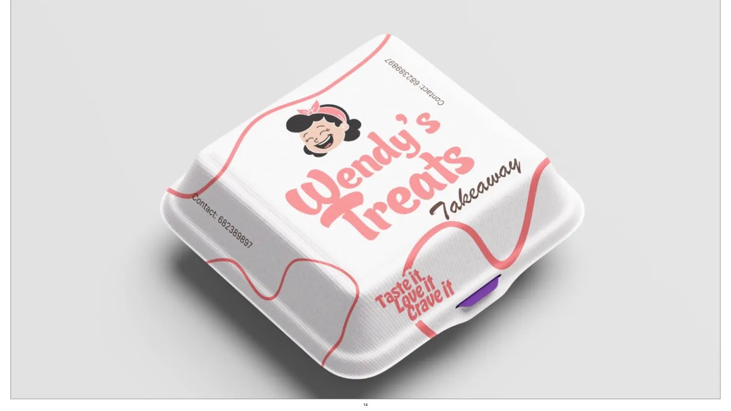
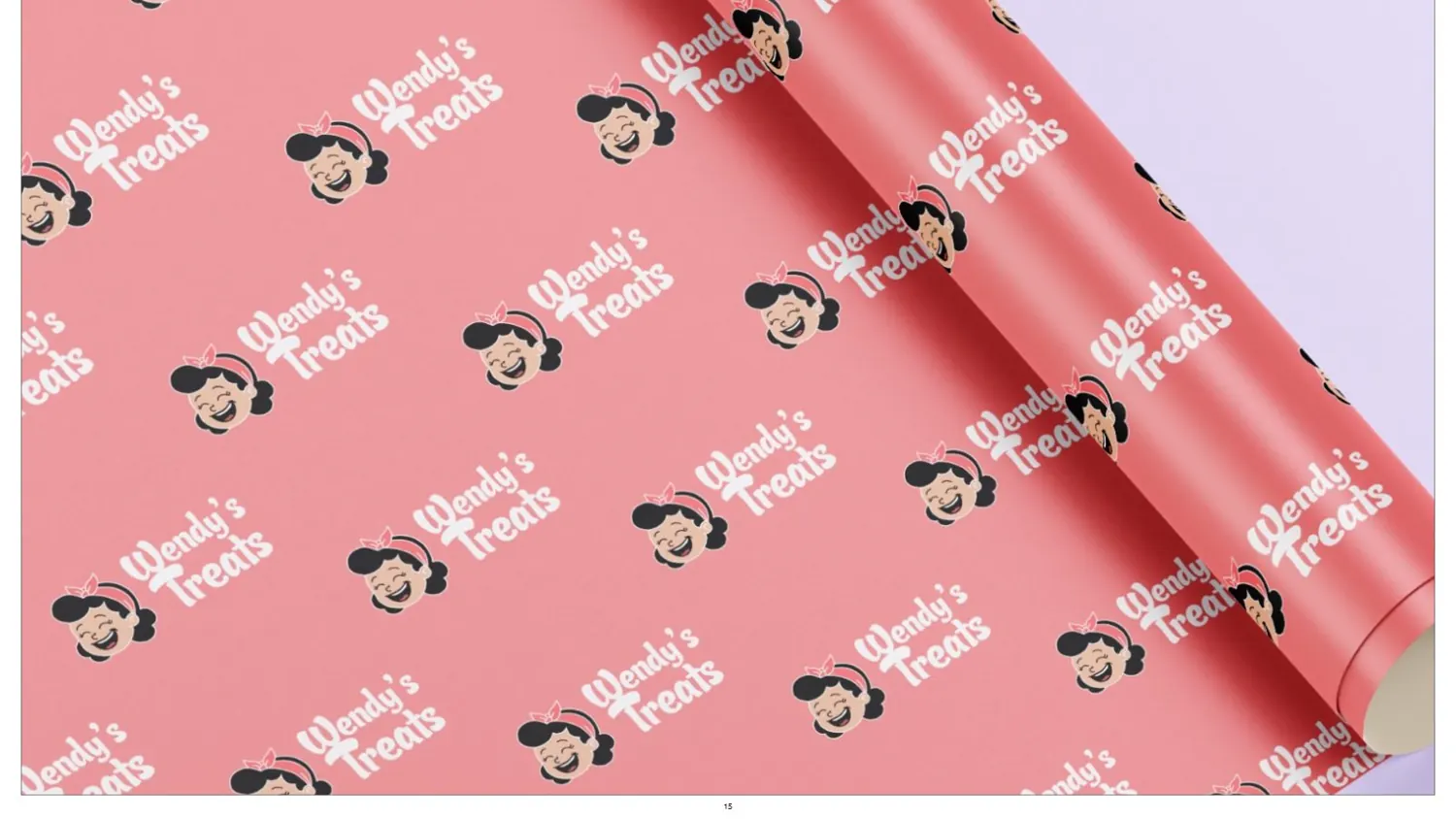
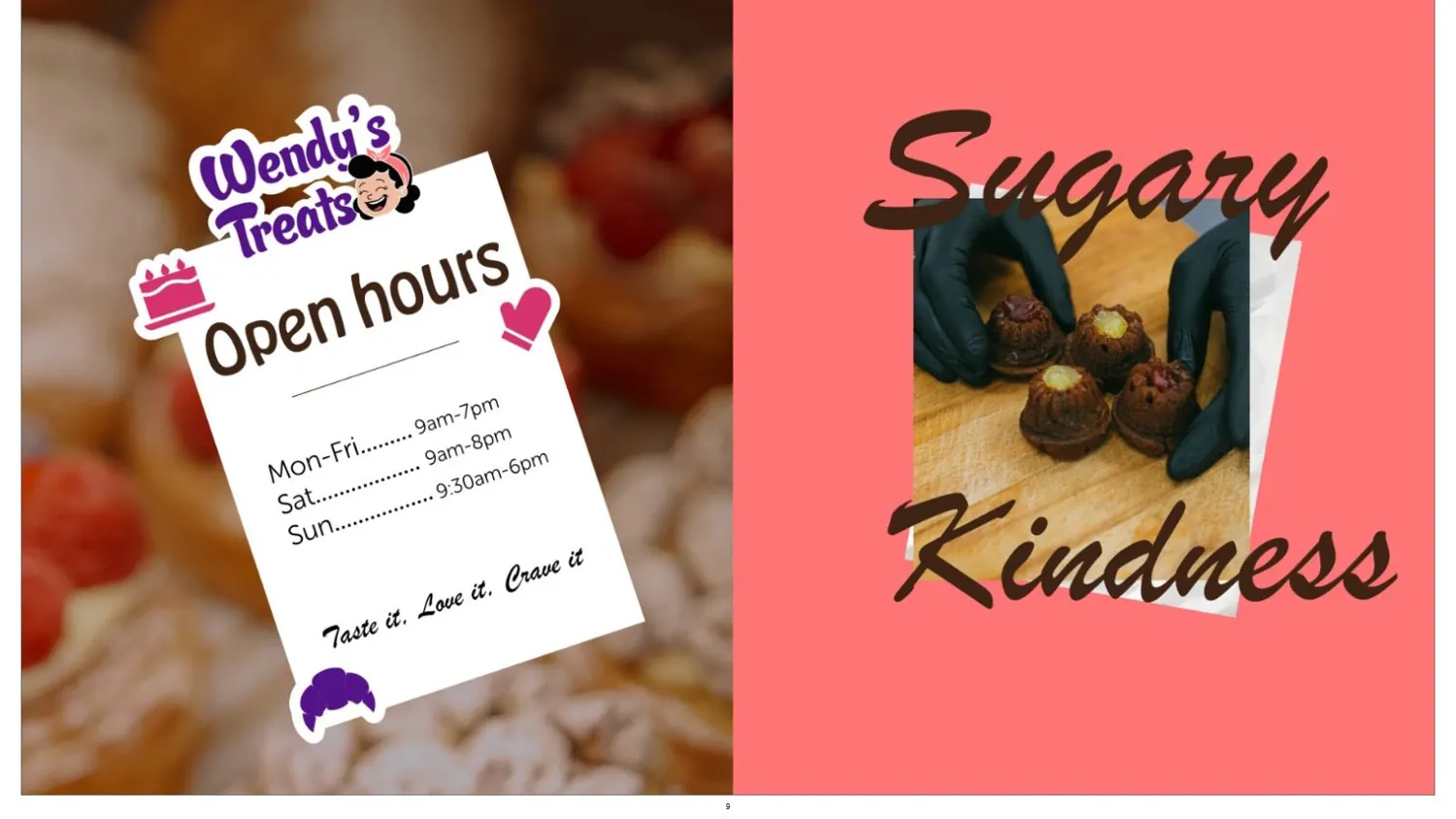
Bags, boxes, aprons, a shop sign. Sugary kindness, everywhere.
Where it landed
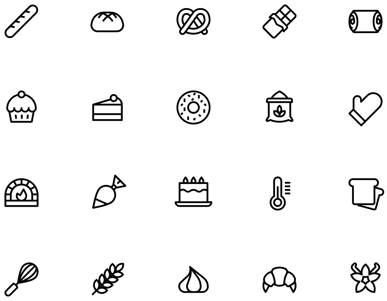
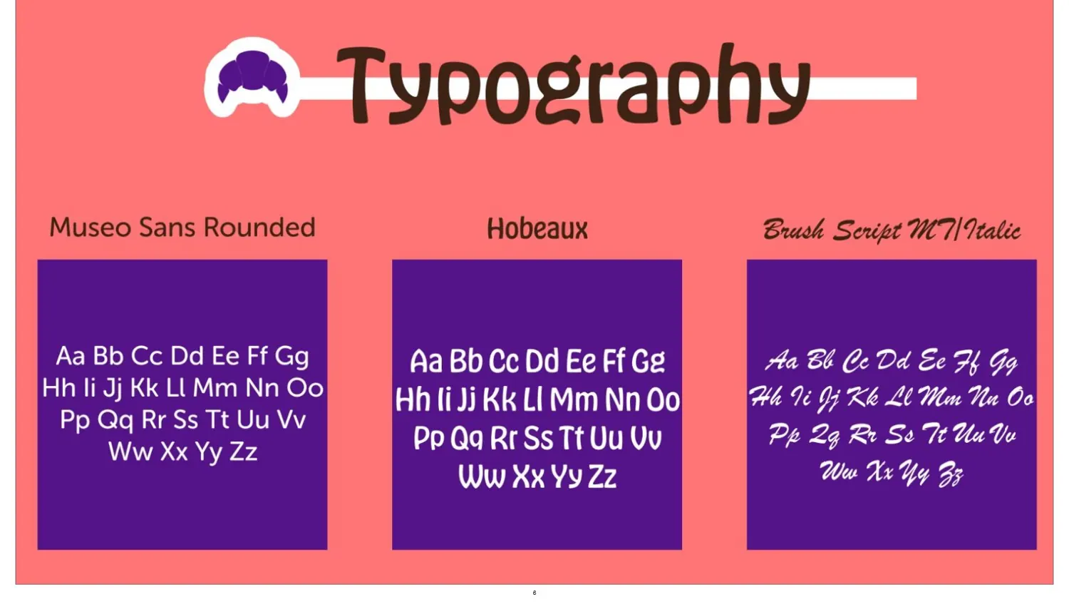
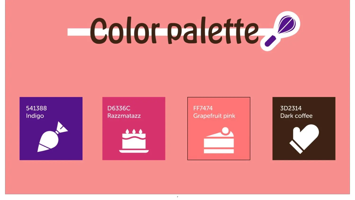
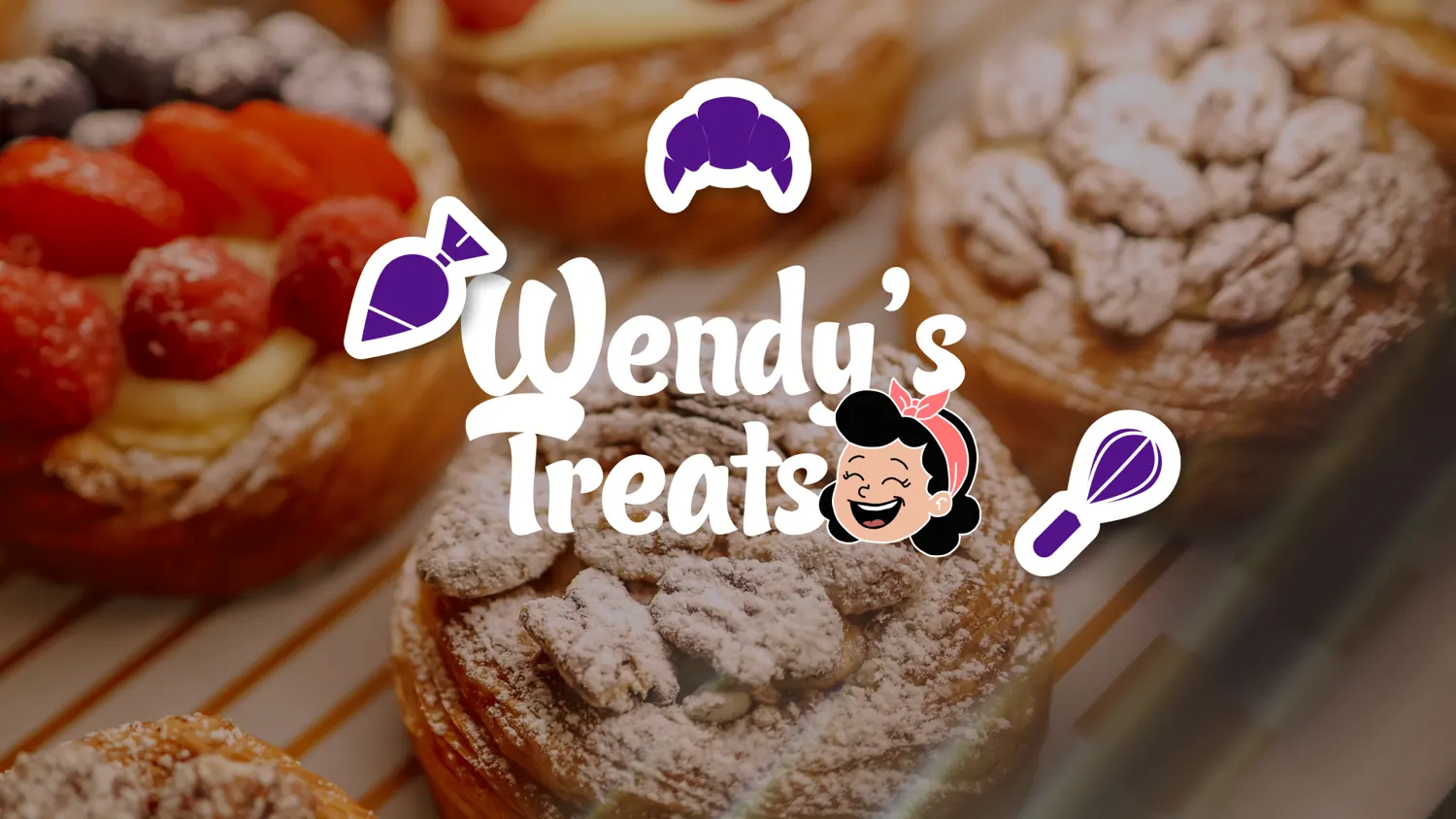
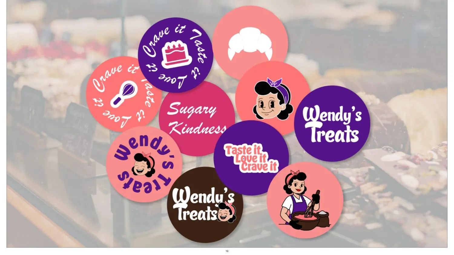
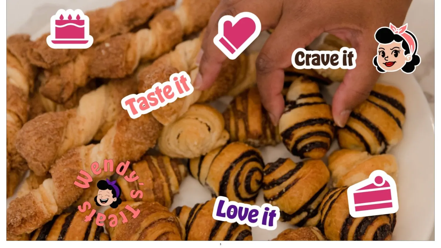
A full identity: wordmark, a mascot drawn from Wendy herself, a sticker-ready icon set, colour, type and packaging. It's hard to be in a bad mood around that mascot.